Wondering about examples of good Facebook ads? If you’ve been on Facebook, you know that bad ads do exist.
A good Facebook ad is powerful enough to stop you in your tracks and divert you away from social networking on the site. And, if it’s really interesting and resonates with you, then you may even be tempted to click to learn more about the offer!
Facebook ads are a proven way for marketers to get their message in front of their target audience and in this article you’ll see 10 examples of good Facebook ads that you can draw inspiration from.
You are going to wish you created these ads yourself!
10 Examples of good Facebook ads
These examples of Facebook ads from companies around the globe, operating in many industries from airlines to snack foods, home decor, and more. Learn what they’re doing right and why their ad is working for their business.
1. ClassPass
ClassPass brings an easy, convenient way for you to book your fitness and salon appointments. They are in over 2,500 cities worldwide.
This is their Facebook ad:
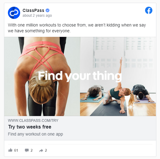
There are several things that are great about this ad.
First, there’s a clear call to action: try two weeks free. This asks for the business in a direct way without leaving prospective clients wondering why they’re being shown this ad.
Their ad image is clear and professional-looking. The text overlay is short, to the point and very effective.
And lastly, the copywriting isn’t too long. It’s not full of distracting emojis which may not work for their audience, and the copywriting is clear, using numbers to draw in viewers, which can be an effective attention-grabbing strategy.
2. HelloFresh
HelloFresh brings convenience and saves time with their delivery-based meals in a box that come to your front door.
You can select your dietary type (meat and veggies, gluten-free, etc.) and the frequency of meals you want for a custom experience. Weekly deliveries include the ingredients you’ll need to prepare and cook the meal in minutes.
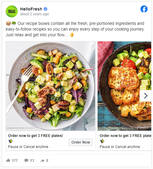
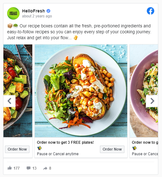
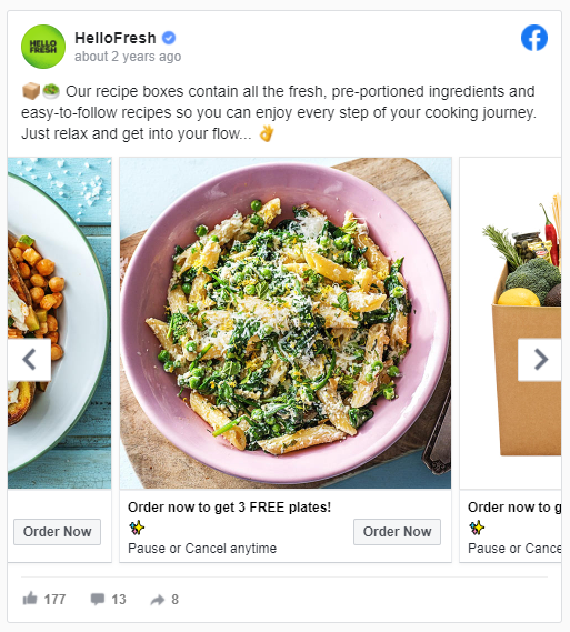
This carousel ad by HelloFresh is doing several things right:
- Clear and attention-grabbing ad graphic: The image is bright and attractive. It’s very appetizing, tempting viewers to click the ad to learn more.
- Descriptive ad copy: The copy is well-written and uses descriptive words sharing the benefits of their service. Words like “fresh” and “pre-portioned” are great identifiers, showing what Hello Fresh can offer customers.
3. SofaLush
SofaLush does sofa slipcovers and uses a video ad that ripples through the many designs they offer, showing their inventory in a distinctive way.
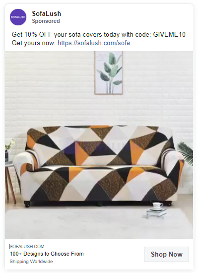
The copy uses numbers again, like ClassPass above, which is a way to use expressive language to talk about the product concisely.
Video ads work well here because SofaLush offers so many different designs that can appeal to many customers in their target market.
4. AirAsia
AirAsia is a Malaysian airline bringing competitive travel deals on flights, hotel, activities, and more. They are the largest Malyasian airline and they fly domestically and internationally.
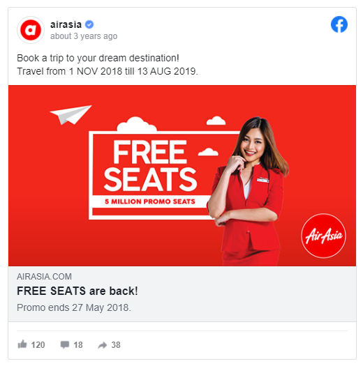
What AirAsia is doing right is using a bold and bright image along with using the word “free” displayed prominently in the center of the ad. They also use the word “free” in their copywriting, which is a strong motivator.
5. Project Repat
This company makes t-shirt quilts that capture the memories from your photos in the form of a quilt blanket.
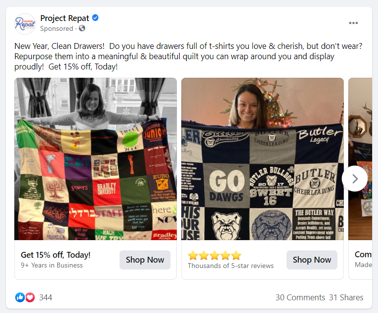
Project Repat does a great job of using user-generated content in their ad. A carousel ad is the perfect ad format to show multiple customer images at once.
According to this source, user-generated content is 2.4 times more likely to be clicked on compared to content that isn’t user-generated.
The imagery does a great job of showcasing the product.
It’s bright and clear. And, the copywriting isn’t too long and uses numbers to share with viewers that a sale is happening, a way to attract their target customer.
6. Lume Deodorant
Lume Deodorant is a doctor-developed natural deodorant company that makes deodorants safe for sensitive skin that are aluminum-free and hypoallergenic.
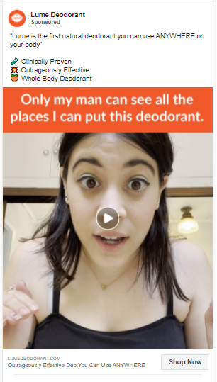
This is another good Facebook ad example using user-generated content.
The way the ad is set up, it looks like they are trying to reach a younger demographic. There are bullet-points outlining the features and benefits, using power words like “clinically proven” and “effective.”
This is a video ad which is a good choice to capture the attention of their audience.
And, they have appropriate use of emojis, substituting an emoji for each bullet point when outlining the major points.
7. Kay Jewelers
Kay Jewelers is a jewelry retailer offering a large array of jewelry pieces for men and women in rings, necklaces, and more.
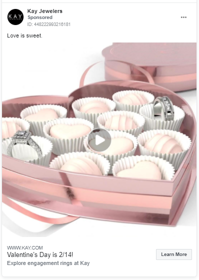
This video ad from Kay Jewelers is simple yet effective. They are running a video ad, promoting their collections for Valentine’s Day and the ad is showcasing the company in an engaging way.
The ad is professionally created, it’s visual, illustrating the experience Kay Jewelers is trying to share, and it’s timely, matching up perfectly with the season.
It’s one of the more simple ads in our roundup but it effectively communicates their marketing message in an easily digestible way.
8. Waze
Waze is a time-saving app that helps drivers get directions to their destination. They also offer carpool options for drivers that want to save money on the cost of commuting while meeting and connecting with cool, new people.
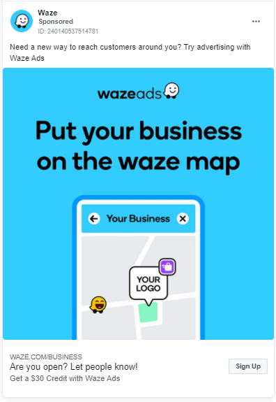
This ad by Waze is one of the examples of companies who do Facebook ads well.
This Facebook ad is clear and to the point. You don’t have to read through the entire ad to figure out who this ad is for and what group of people it would benefit.
The ad graphic shows the offer clearly and leaves little to no question about what this advertisement is about. It also paints the picture for the prospective customer about what it would look like, working with Waze.
So, the ad that tells their audience what the ad is for, how it will benefit them, and it helps the prospect to visualize what it would look like to partner with Waze.
9. Headspace
Headspace is an app that promotes focus and stress-management. They help you accomplish this by teaching you to be mindful for 3 minutes everyday and this mindfulness can bring enormous benefits, like:
- Better sleep
- Stress management
- Less anxiety
- Better focus
- Improved fitness
- And, more!
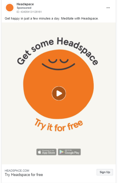
This ad does a great job of showing you what the company can do for you, helping you achieve relaxation and calm.
It’s a video ad with no sound and if this feels strange, you may not know that around 85 percent of Facebook videos are watched with no sound.
Without sound, Headspace does an excellent job of sharing their message using video and text. The video is short, which goes hand in hand with the short attention span of people these days.
The colors are bright and this is an ad that will definitely stop your scroll on Facebook. The ad is meant to attract their target audience with it’s simple design and brief video. It works!
10. Tokyo Treat
Get Japanese snacks straight to your doorstep with Tokyo Treat.
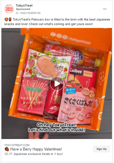
This video ad is product-focused, showcasing potential customers exactly what the product delivers and what their experience will be like opening the treat box.
The video is an unboxing, showing the model opening the box and sharing a few of the snacks inside, with text overlay at the bottom of the video ad, telling the viewer about the product.
The ad copy is short and uses emojis in a professional way, which goes along well with the style of the ad and video. They use numbers to tell prospects how many treats come in each box, drawing them in with words like “best” and “love.” Nice job here.
Want more examples? Here are 7 more great Facebook ads.
What makes good examples of Facebook ads?
A lot goes into the ad creation process, from researching the target audience well, creating the ad graphic or video, coming up with winning copy, etc.
The Facebook ad creation strategy that works for one company may not work for another.
Remember, when creating your Facebook ad, keep your audience in mind.
Experimenting with different kinds of ad formats, ad creatives, and doing A/B testing is going to help you get closer to creating the perfect ad for your audience.
Hopefully these Facebook ad examples give you some insight into what can make a good ad. Facebook ads are definitely here to stay so it’s great that you’re diving into this with the desire to make your ads the best they can be.
Need some help with your ads?
Consider checking out our Facebook Side Hustle course, which will help you make money with Facebook ads. You’ll learn how to run Facebook ads for businesses in your local community, earning up to $1,000 to $2,000 per month or more – per client.
- Discover how to set up Facebook campaigns for local businesses
- Learn how to find clients who want to work with you
- Find out exactly what to say to get prospective clients to work with you
Click here to learn more about the course.
What do you think? Comment below to let us know which Facebook ad example is your favorite.

Leave a Reply