We see Facebook ads all the time, but have you stopped to think about what makes truly great Facebook Ads? The ones that stop you in your scrolling tracks and get you to click and learn more without any hesitation?
As I’m sure you’ve guessed, nothing on Facebook happens by accident — and this includes the effectiveness of ads and how they are structured. There is a science behind creating a click-worthy ad.
Whether you’re a small business owner, a real estate agent, or marketer looking to up your Facebook ad game, there are several examples available to you for creating the right ad strategy.
There are tried-and-true strategies and tactics, you only have to decide which ones you want to incorporate. Here are 7 examples of great Facebook ads and how you can select the winning tactics and weave into your own Facebook ad campaign.
#1 The short and sweet headline
Using an effective headline is one of the best ways to capture someone’s attention. Imagine your ideal client is scrolling through Facebook looking for the latest cat video. You need a way to tear them away from their personal activity. The right headline accomplishes this.
And while it may be tempting to put all your information for your ad within a headline, this is where you need restraint. A good headline can be accomplished with only 5 or 6 words.
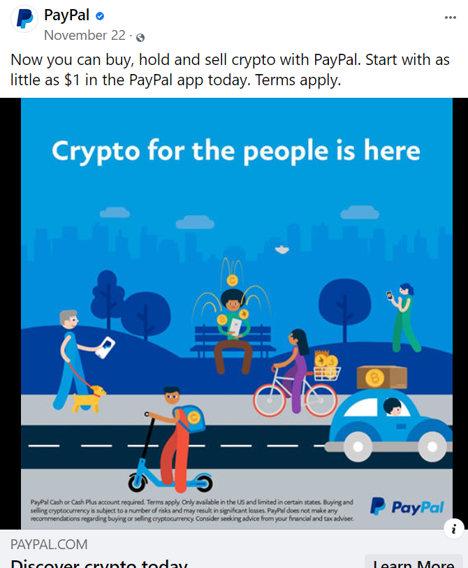
For example, notice this PayPal ad on Facebook. The headline is short and sweet: “Crypto for the people is here” and is designed to steal your attention away from scrolling with a short message. This is a perfect way to grab a second look from someone who has shown interest in cryptocurrency.
#2 The high quality image
It’s probably not a surprise to learn using high quality images boosts engagement with a Facebook ad. And using visual images continues to increase in popularity. You can boost your chances of someone engaging with your Facebook ad by adding a high quality image to it.
You should also choose a bright, eye-catching image — especially since your ad appears small on a tablet or mobile device. Your colors should pop in contrast to what colors people often see in their newsfeed. Facebook’s color scheme is blue and white, so a contrasting color scheme is ideal.
If you’re using a photograph, make sure it’s a high-resolution image, which means at least 300 ppi (pixels per inch). If you aren’t sure how to find this here is a calculator.
In addition to using a high quality image, Facebook has a list of best practices for your pictures in ads too, including:
- Use an aspect ratio of 1:1 for a Facebook newsfeed. This means the height and width of your picture are equal.
- Make sure your brand or logo is prominently displayed.
- Avoid too much text around your image.
But you don’t have to stick to only photographs. You can use a snippet from an infographic or other graphic design elements, such as a drawing, to illustrate the point of your ad. You can also use very short videos.
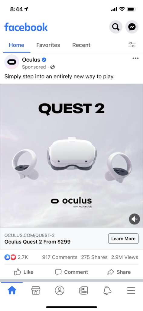
This ad from the Oculus Quest 2 has very limited copy, but the visual is stunning because it uses high quality images.
#3 The convincing copy
You may assume the goal of your Facebook ad is to sell someone on something. But truthfully, that’s not always the case. Providing convincing and compelling copy takes on many forms, and using statistics is a strong way to illustrate a point or grab a reader’s attention.
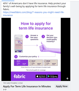
Here’s an example of a great Facebook ad from Fabric Insurance. The copy of this ad serves two purposes:
One, it uses a statistic for more compelling copy. It opens up with information on how 40% of Amercians do not currently have a life insurance policy.
Two, this ad goes on to address another major obstacle with life insurance – the process to obtain it. The ad uses simple copy to show how easy and quick the process is
#4 The actionable copy
Your Facebook ad needs a goal. After all, you’re creating a campaign to yield results for your business or for your client. Whatever your goal is, using a strong call to action (CTA) should be part of your messaging too.
Create a clear CTA once you do decide on the goal and the type of ad you’ll use to support your goal. There are a variety of ways to add action to your copy, and persuade your audience to take action. Use words such as:
- Subscribe
- Add to cart
- Download
- Shop now
- Get a quote
- Click here
- Apply now
- Learn more
- Contact us
- Install
- Book now
- Read more
Who knew there were so many different ways you can ask a reader to engage with your ad? Choosing the right call to action goes hand in hand with knowing the goals for your ad campaign.
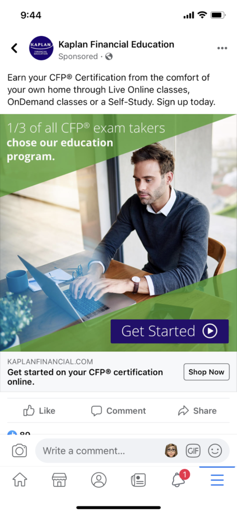
Check out this ad from Kaplan Financial Education. The goal is clear: to get people to sign up for their Certified Financial Planner certification program.
#5 Using emojis (but on a limited basis)
It’s hard not to love emojis. And considering 92% of the population use an emoji on a daily basis, it’s safe to say most people are used to seeing them in their messaging. And why not? Emojis add a touch of whimsy and expression within a simple visual. When used correctly, emojis add a fun and casual element to a Facebook ad, which can instantly draw attention.
Of course the flipside of this is to not use too many emojis. While there’s no hard number to use, as with many design elements, less is probably more when it comes to using them.
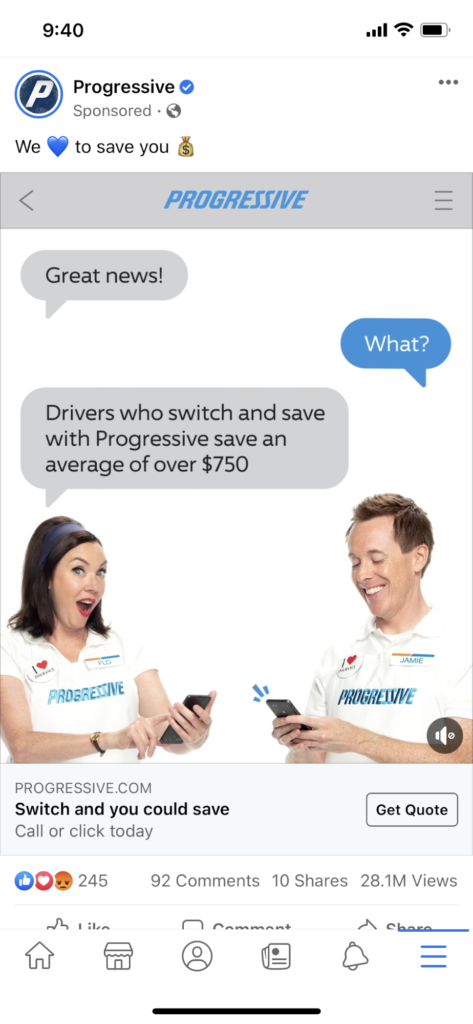
Check out this ad from Progressive. Not only are emojis used to draw your attention to the ad, but the actual ad copy features emojis as the conversation continues within the short video.
#6 The irresistible offer
Adding an irresistible offer to the mix is definitely one way to get your ad noticed. Whether your offer is free shipping, a promo code, or promoting a specific sale.
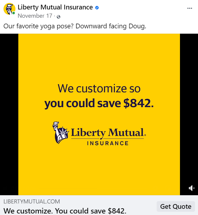
This Facebook ad from Liberty Mutual Insurance is an example of putting the best offer out there. By clicking on the link for a quote, you could save $842 on your insurance. This is a strong offer.
The goal is to get someone to request a quote, and the offer of $842 in savings is used as the lure.
You can create a further sense of urgency by putting a timetable around your offer. For instance, adding language such as “limited time savings” or “act fast before items sell out.”
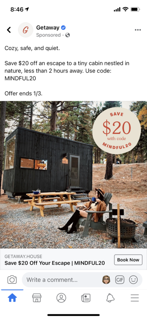
Here’s an example of another ad, where the offer of $20 off a Getaway experience expires by a specific date.
#7 The post-click landing page
Another tactic to use with your Facebook ads doesn’t involve the ad itself, but rather where your reader goes once they engage with your ad. This strategy is to have a landing page attached to your call to action.
In other words, when someone clicks on your ad, it takes them to a specific page on your website. This allows you to direct traffic to a dedicated page, where you can thoroughly track your ad results and quickly know how many readers are engaging as a result of your Facebook ad.
This is especially easy when you have a “download now” CTA, but it’s helpful no matter what the goal or CTA is for your ad. You know how many readers choose to download your offer because you have a specific link taking them to a dedicated site for downloading. This way, you can track the results of your ad and understand what is (or isn’t) resonating with the target audience.
Here’s an example from BeachBody. The first part of the Facebook ad is what you see when you’re scrolling:
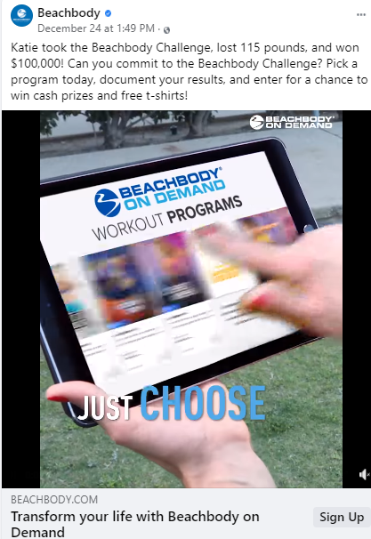
Here’s the dedicated landing page from BeachBody, when you click on the ad to sign up and learn more:
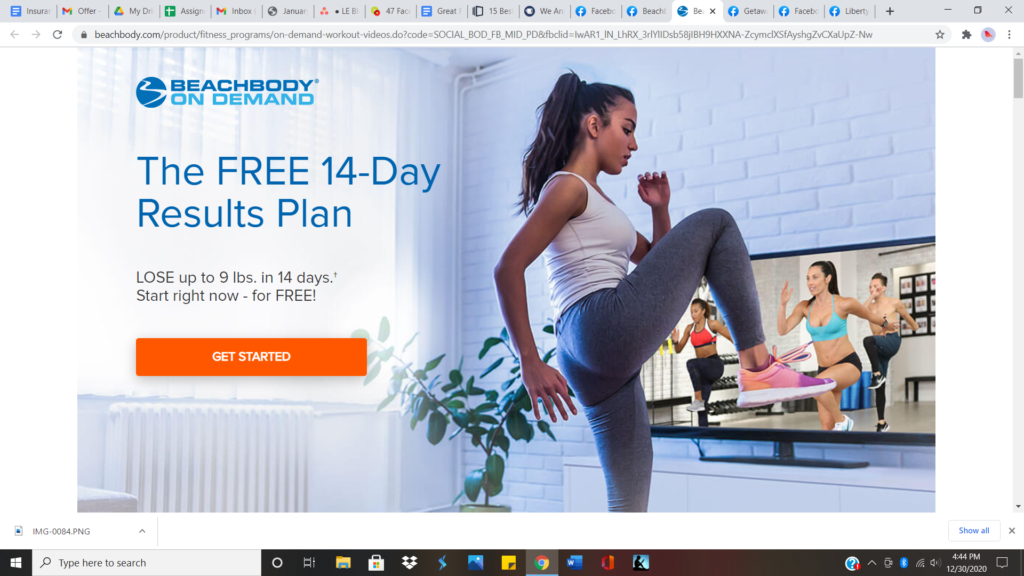
BeachBody is using a specific URL for those who sign up from their Facebook ad. You can implement the same technique with your campaign, and know exactly how many are taking action from your ad.
Evaluating the goal of your Facebook ads
As mentioned earlier, it’s important to note that no matter what type of Facebook ad you choose, you should have a clear goal in mind before you launch your campaign. Once you’ve identified your goal, then you can narrow down the specific type of ad you think would work best for your goal.
Think about the following goals and how different ads would appeal to your target audience. Goals such as:
- Increase brand awareness among women aged 25-44 for your business
- Reach a more targeted audience, such as men aged 18-34
- Gain subscribers to your newsletter or blog
- Increase the CPM (cost per thousand impressions) for your ads
This is only scratching the surface of the goal you might choose for your ad campaign. Before you get started, take time to identify your goal for your ad, then it will guide the strategies for your campaign.
Final thoughts on creating great Facebook ads
A great Facebook ad doesn’t have to be a marketing mystery. There are simple, yet effective, principles to follow to yield the best results from your campaign. Whether you choose to grab someone’s attention through a statistic, an amazing photograph, witty copy, or a combination of all of these.

Leave a Reply