Are you looking for examples of great Facebook ads? Awesome, we’ve got you fam!
As a budding digital marketer, one of the best things you can do is understand what it takes to make an amazing, eye-catching, and effective Facebook ad. This helps you see what works well, so you can implement those practices in your own ad strategy.
But remember, use these for inspiration! Don’t actually copy them. You can write yours similarly and even have a similar photo, but don’t actually copy them.
Keep in mind, also, that many successful Facebook ads don’t LOOK like anything else or any other ads, so use these examples of great Facebook ads to get your brain juice a’flowin’. Let these inspire you to come up with something that’s all your own.
We’ve thrown in some best practices at the end of this article to help you with the unseen aspects of creating amazing Facebook ads.
Want to learn everything you need to know about Facebook ads? Our Facebook Side Hustle Course teaches you how to start your own digital ad agency on Facebook.
7 examples of great Facebook ads and why they work so well
1. Porsche’s Facebook ad
This ad is visually stunning, which is part of its charm. It’s also dynamic in its cards, though the overall message is cohesive. Also, cars. Who can resist looking at an ad for something sexy like a Porsche?
Why it works
This ad uses images and short videos to its advantage. The videos show genuine people enjoying their product, alone and with friends. They show off the car much less in this ad because they’re trying to focus on the experience of a Porsche, not necessarily the Porsche itself. The last slide is actually a nice photo of some people with their classic Porsche.
The message is clear: once you go Porsche, you have a ton of fun and never go back.
In addition, the CTA is incredibly clear, and it isn’t “Buy a Porsche!” — it’s to engage their Facebook bot about what kind of sports car you own, even if it isn’t a Porsche. This ad is, by default, engaging. The soft call-to-action is clear, but it’s also asking a relevant question of people who like sporty vehicles.
They know they aren’t going to sell you a $60,000 car over Facebook. But, they also know that they have something pretty and want you to think about it the next time you go to purchase a car (especially if you’re heading towards your midlife crisis).
It’s a great ad, and when targeted at the right audience, it would work as both an audience engager and a list builder for an incredibly high-end product. Huge win for Porsche!
Learn about Facebook Live ads at Everything You Need to Know About Facebook Live Ads.
2. Allbirds ad
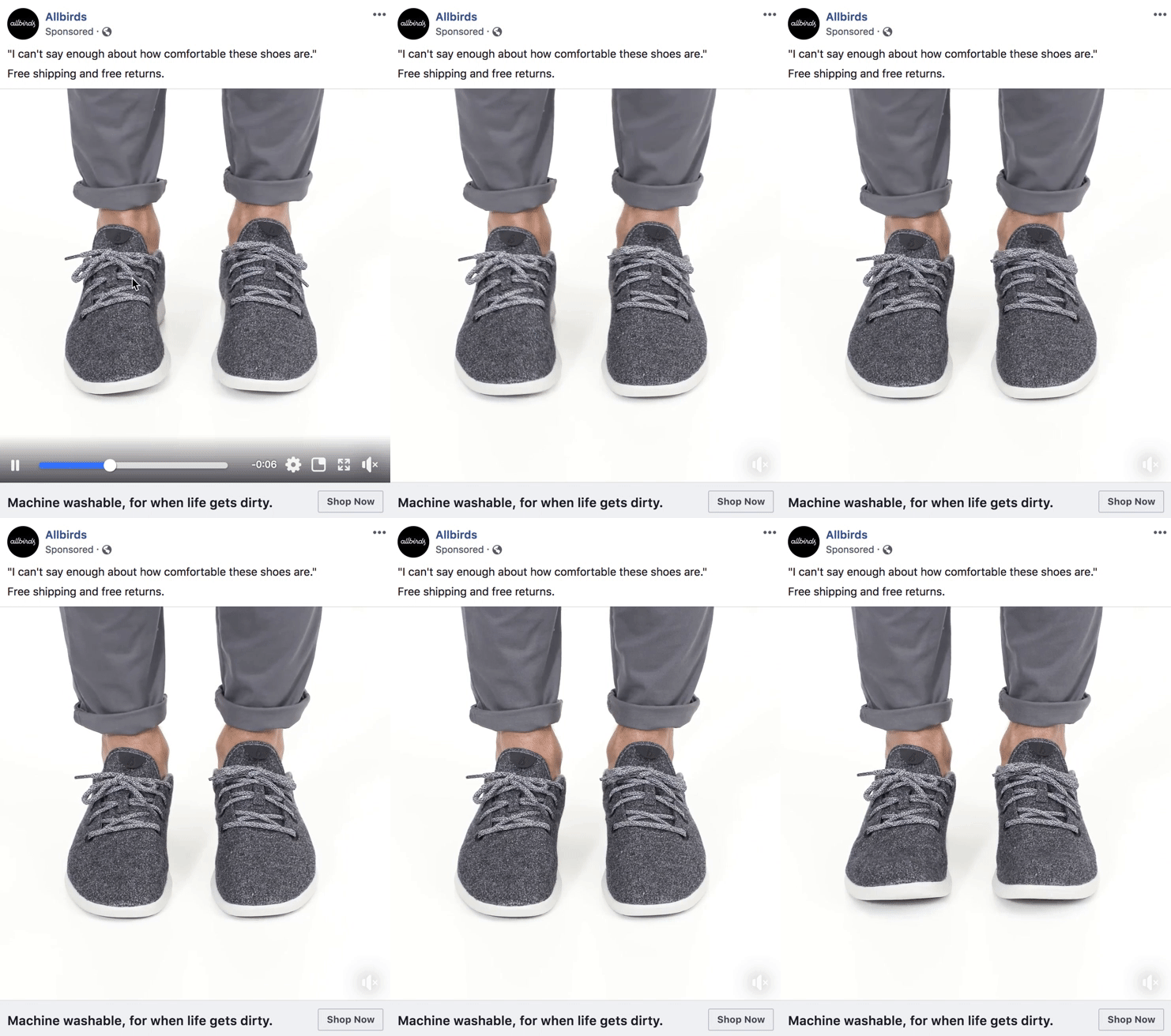
A simple, short video showing off how comfy these shoes are (how can you not look at it and want to buy these shoes?). You can almost HEAR those happy toes rubbing on the inside of those shoes.
Why it works
This product isn’t showy — in fact, plain grey shoes are exactly the opposite. But, the foot movement really shows how comfortable they are going to be.
However, that’s kind of the point of this ad. They’re trying to show the simplicity and comfort level of their humble shoes. They complement this with short, easy-to-read content and a great testimonial. This whole ad screams “simple,” which makes it easy to see the buy now button.
There’s only one way to go from here, Captain, and that way is tappity-tappin’ on that button.
Are you running real estate ads? Learn it all at Your Complete Guide to Running Successful Real Estate Facebook Ads.
3. Moo.com Facebook ad
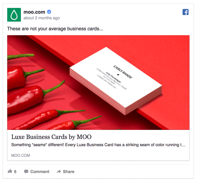
We… listen. We’re not sure what’s going on in this ad any more than you are, but what we can tell you that whatever it is, it’s making us stop and look. Hot peppers. Dark red. Pop!
Why it works
This is a less traditional ad which means it automatically catches the eye and makes people pause. Red is a warning color, but it’s also the color of passion, so seeing some peppers on your feed does make you rethink whether you should keep scrolling or not. That is the strength of this ad.
While this ad was pretty successful for the company, it does fall short in one big area — the call-to-action. You’re not sure what you’re supposed to do because there’s no link and no button. This makes it difficult to explore the product further.
4. Pura Vida Facebook ad
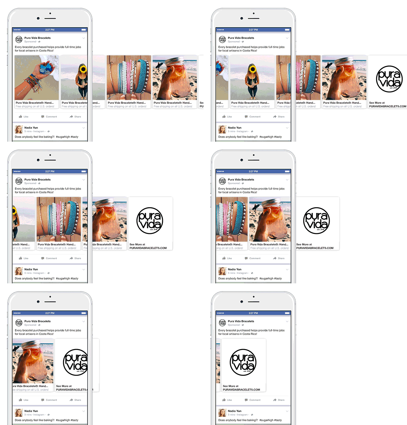
Bracelets! What pretty gorgeous bracelets. As far as examples of great Facebook ads, this is a great example of a carousel ad set for a company with a good heart and a pretty product.
Why it works
This ad is visually striking and not only has a pretty product, but the product is displayed in a pretty way. This is ultimately very appealing to a lot of people, especially women who like the beach (which is the target audience here).
In addition, the call-to-action is straight-forward and doesn’t even press the viewer to buy, simply to look for more bracelets, and the subtext offers free shipping. That’s a good deal to a lot of people, making the value proposition here very enticing.
For those who are especially conscious of their purchases, the ad tells viewers that Pura Vida cares about helping people. Getting something pretty AND helping a sister out AND you don’t have to pay shipping? That’s a winner on a lot of levels.
Make sure your ad specs are on point! Learn more at Everything You Need to Know About Facebook Ad Specs.
5. Web Summit Facebook ad
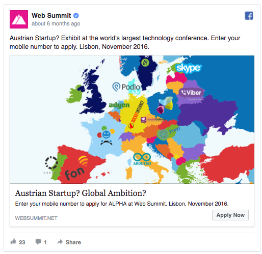
Guessing not many of you are Austrian, but that’s not the point here.
Why it works
There are bright colors and recognizable brands — Skype, Spotify, and probably more than that for Austrians. But, the strength of this ad comes from its relevancy and personalization.
Then there’s the CTA. Instead of the “Read More” or “Learn More” that you typically see, there is the “Apply Now” button. That implies exclusivity, which is always a little tempting for us (and how Pinterest made it big).
Want to help small businesses reach more people? Learn how at Facebook Local Awareness Ads.
6. Calm Facebook Ad
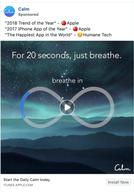
You feeling sleepy yet? This ad is the perfect mixture of useful and beautiful, and it’s calming to just look at it. Ahhhh, those mountains…
Why it works
The big thing about this ad is that it has a great value-add. It’s interactive and the best part is that you can interact with it for free.
It’s useful if you’re scrolling your feed and feeling stressed. If you do stop, and you do like it, you’re much more likely to click on the very clear call-to-action and install the app.
In addition, testimonials at the top thing are really big right now because it really works well for a number of niches. Why? Because the vast, vast majority of people (over 95%) look at the reviews before purchasing. So why hide good ones? Throw them up on your ad. Make it easy!
Is your CTR on point? We tell you all about it at What is a Good CTR for Facebook Ads.
7. Holini Facebook ad
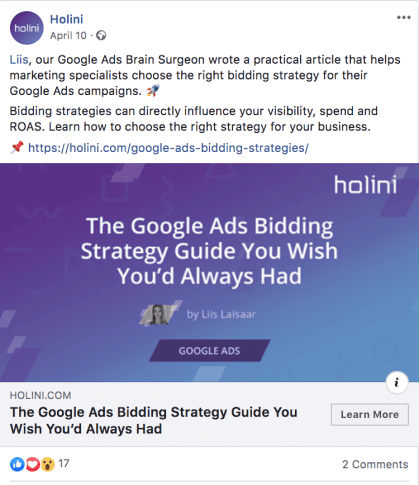
Well, look at this! We have a successful ad that’s dominated by text — this is usually a big no-no in Facebook’s world, but this guide was downloaded thousands of times through this ad. So what did they do RIGHT that would make up for all those words?
Why it works
Everyone likes free stuff, making this value proposition a strong one because free is better than cheap. Plus, if you’re the right market — and your targeting is going to have to be bang-on for something like this — you’ll want to know more about Google Ads and how all of that PPC stuff works.
Plus, this ad pulls out confidence as a tool. They have a guide, and they know you’re going to WISH you always wanted it — yes, it’s that good. So what does it cost? A click.
Most people that might be interested in this kind of thing will pay a click, especially when that guide is written by a “Google Ads Brain Surgeon,” which suggests authority on a subject (even if it is kinda corny). Free authoritative information is going to be a win most of the time, even if the ad doesn’t pop in other ways.
What do these examples of great Facebook ads have in common?
There are tons, and we mean TONS, of things that go into a Facebook ad. You might just see a pretty face on a page, but… HOW did that ad come to you? WHY did it choose you? Or, more likely, who’s stalking you? Even if that is a little creepy.
There is more than the design, text, and CTA that goes into each of these ads.
The unseen and unknown qualities of great Facebook ads
There are a couple of things behind great Facebook ads that you never see. You’ve already seen some examples of great Facebook ads, but here’s what you’re not seeing in these ads. We’re talking about the not so obvious stuff.
Targeting
Targeting starts with easy things like area and demographics, like people in a certain zip code at a certain income level. However, there are thousands of interests and various other ways to target an audience that will shrink or grow your audience and entirely retarget any ads you have. This is really one of the bread-and-butter items of the best Facebook ads.
Budget
While there are a number of really great Facebook ads that run and do really well with small budgets — as little as $1 a day!— there’s no fooling anyone: if you want your ad to reach a LOT of freakin’ people, you’ll have to pump a LOT of cash into it.
Sometimes you don’t have that kind of cash, and that’s okay. Your ads can still be really successful, but bigger budgets do often mean more reach.
Niche
Some niches do REALLY well on Facebook. These are often service-based niches that are easy to create valuable freebies for, and appeal to folks who take advantage of these sorts of deals. In the examples of great Facebook ads you saw, the Holini and Web Summit ones take advantage of their niches.
Some niches don’t have that kind of person, and even some niches within niches don’t. For example: people who read romance novels? They will pick up a book for a few bucks if they see an ad for it. Self-help? With some good copy, same. But thrillers, science fiction, experimental novels — these are much more difficult.
Size of page running ads/connections
One of an advertiser’s biggest strengths is an engaged audience, and where better to find one of those than the people who have already expressed that they like a company?
Pages with bigger followings have larger connection networks to pull from, which is incredibly powerful. The only time this doesn’t work well is when a page has several different types of audience and is very niche specific.
A great example is something like Zillow. While Zillow is one company, it cultivates two different audiences — buyers/sellers, and real estate agents. This is when using the audience can be a bit less effective, but it’s still a good place to start.
Custom audiences
Some companies have the benefit of mailing lists or other lists of people who have done business with them (psst… if you have this, take advantage of it!). These are something that Facebook calls custom audiences.
While you can’t exactly target the people on your list in every situation, you CAN create a lookalike audience that LOOKS and ACTS like your custom audience and target them. It’s… insanely creepy, but also insanely effective.
Relevancy
One of the most overlooked facts of a Facebook ad (or any ad really) is targeting to a relevant audience. This is because in times past, advertisers did a lot of guesswork. If you were a car salesman in Salem, OR, you put up an ad on TV to the people in Salem and prayed that someone was looking for a car. If you were trying to sell vacuums, your job was more to convince people door-to-door that they needed a new vacuum. It’s a shot in the dark, but it’s something.
These days, we can target ads towards relevant audiences. So now, if you’re advertising something for babies, you can just exclude people who don’t have kids.
This makes for a better ad experience for end users but also a better experience for YOU, aka more bang for your buck. And, all of the examples of great Facebook ads you’ve seen in this article make sure they find an audience that’s relevant
Call-to-actions
The reality is that people need to be told what to do, and exactly how to do it. A good CTA tells your audience exactly what to do — “Learn More,” “Apply Now,” “Install Now,” etc.
You’re giving viewers one direct path. There’s no confusion. If your ad is good, then they click the button just like you told them to.
Awesome visual
Okay, this is something you can see, but it’s important enough to mention. Your picture or video should be beautiful. Even if it’s simple, it should be beautiful. This means different things for different niches, but here are a couple of general guidelines:
- Simple
- Genuine
- Fitting your niche
- Showing happiness, if possible (people go to Facebook to relax, not to stress out)
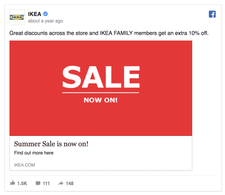
Here’s IKEA’s ad for an example. While we don’t love this one, it matches all of these guidelines — you best bet that all of those IKEA nerds out there are going to go flocking when they see this. IKEA never has sales. Maybe… maybe we’ll just… click that picture real quick…
Plus, that bright red color and simple text catch your eye. Ain’t no one scrolling past this ad.
Grammatically sound
This is pretty straight forward. Run everything through spell check. Have someone proofread your ad. Make sure the emojis you use are universal and have Facebook versions (read: don’t create Facebook ads from your iPhone).
Spam isn’t okay
Don’t try to get around Facebook’s filters to advertise a Disneyland cruise.
Don’t make an image that makes promises you can’t keep.
Don’t try to advertise things that Facebook doesn’t allow you to advertise.
Don’t lie to your audience.
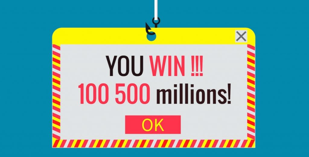
Don’t do this.
The final word on examples of great Facebook ads
While the examples you saw were all put out by big companies with big ad teams and big ad spends, even the little guys can create an amazing Facebook ad.
Sometimes you get a unicorn, which is really freaking awesome, and if you do, study the heck out of that ad to see what made it work so well.
And the ones that don’t work, well… make one change and test it. Then tweak again and test as needed.
Trust us, you’ll get it!

Leave a Reply