Facebook banners (or cover photos), are the large, rectangular shaped image at the top of your Facebook page. Using the correct Facebook banner size is key because this is valuable real estate on your Facebook page.
Choose an image that’s too big, and your image will be cropped, risking the chance of losing important content. Too small of an image, and it can become pixelated and stretched.
Considering that Facebook banners are the first thing a user sees when they click on your page, this guide will help you portray the best first impression possible.
Quick tips for the right Facebook banner size
I’m going to go into detail on all of these things below, but I want to give you the tl;dr version if you’re searching for some fast advice.
Facebook banners should be 820 X 360 to look their best. However, they don’t actually display at that size. Personal and business pages display at 640 X 360 on mobile and 830 X 312 on desktop.
You’ll want to make sure they are at least 400 X 150 so they don’t look stretched or pixelated.
Facebook Group banners should be 1,640 X 856. And Facebook Event banners should be 1,200 X 628
When designing your banners, avoid putting important content around the borders and download them as a PNG file if the image uses a logo or has text.
Now keep reading to get more explanation, details, and best practices for creating a Facebook banner.
Related: What’s the Perfect Facebook Ad Size?
Facebook banner size — the right dimensions
Facebook banner sizes vary based on what kind of page you’re making them for. Let’s start with what size you need for business pages. These are the same dimensions for personal Facebook pages too.
Facebook says banner sizes display at 830 pixels wide by 312 pixels tall on computers. On smartphones, your banner displays at 640 pixels by 360 pixels tall.
Facebook gives explicit directions so you can get the correct banner size for your Facebook page. Images must be at least 400 pixels wide and 150 pixels tall.
But here’s the thing, depending on the size of your computer or smartphone thing, it’s not uncommon to lose some of your image once it’s uploaded and displayed. There’s a sweet spot you can find to guarantee that your image displays properly on any type of screen.
To find that sweet spot for your Facebook banner size, I recommend using an image that is 820 x 360 pixels and keeping all of the important text and graphics in the center of the rectangle.
The center is the safe zone, where you can guarantee users will see whatever logo, images, or text you’re using in your Facebook cover photo.
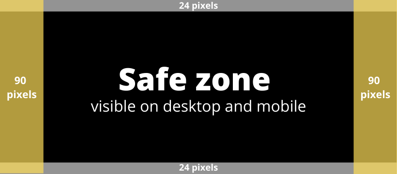
From the guide above you can see that within the 820 x 360 pixels image size, there are 90 pixels on either side and 24 pixels on the top and bottom that are considered outside of the safe zone.
The 90 pixels on either side will be visible on a computer, but not necessarily mobile. The 24 pixels on the top and bottom are visible on mobile, but users may not be able to see them on a mobile device.
Whatever is in the center safe zone will be visible on computer and mobile.
Why the Facebook banner size safe zone is important
Remember, your cover photo is valuable marketing real estate. It’s one of the very first things a user sees when they click on your business or personal page, and you can use it for marketing purposes.
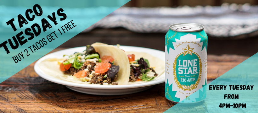
Here’s an example for a Facebook banner for our fake restaurant Ben’s Burrito Barn, who’s trying to capitalize on that real estate by advertising their Taco Tuesday. Below is the image at the recommended 820 x 360 pixels size:
Here’s what happens when you apply those safe zone borders:
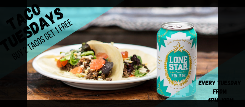
Depending on how the user is viewing that page, you lose a lot of important information.
You want your image to fill the entire 820 x 360 pixels, but keep the most valuable parts of that image more centered in the banner.
Facebook group banner size
To keep things interesting, Facebook has different banner dimensions for group pages. The image for your Facebook group banner should be 1,640 x 856 pixels.
Just like your business or personal page’s cover photo, you want to keep all of those most important information towards the center of your group’s banner so it’s not lost on one screen versus another.
Facebook event banner size
Facebook mixes it up even more when it comes to event pages. Your event banner image needs to be 1,200 x 628 pixels.
And yes, the same recommendation applies with keeping all of the most pertinent information towards the center of your image. You don’t want something important like the time or date to be cut off, even if that information is listed in the event description. Make it easy for viewers.
Related: Everything You Need to Know About Facebook Ad Specs
What file type to use for your Facebook banner
Facebook recommends a sRBG JPEG for both your banner image and profile picture. This will give you the fastest load time, and JPEGs are generally best for photographs and realistic images.
However, Facebook also recommends that if your banner includes a logo or text, you should use a PNG file. The reason is because PNG files are lossless compression file formats. You won’t lose any small details — drawings, lines, text, or iconic graphics — that make your image stand out.
5 tips for a Facebook banner that stands out
1. Follow Facebook’s branded profile guidelines
Facebook has explicit guidelines for what can and cannot go on a branded page, and just so we’re clear, a business page is considered a branded page.
These are mostly common sense guidelines, but you’d be surprised how many people overlook this information. Neglecting to follow Facebook’s rules can result in having your page temporarily
You can read the full policies list here, but here are the most important takeaways:
- Nothing misleading, do not advertise scams or deceptive business practices
- Do not attempt to impersonate another brand, entity, or public figure
- Your cover photo cannot include a verified checkmark, third-party products, brands or sponsors
Your Facebook banner photo is public, so anything you put on it will be seen by anyone who clicks on it. This goes for personal and business pages, events, and Facebook groups.
Keep your Facebook banner as professional looking as possible — it’s a reflection of your business and the first thing someone sees when they click on your page.
2. Show off your brand’s personality
There’s power in images. What seems like a simple photo can quickly tell a person much more about your business or brand than you might think. Research shows that the human brain processes images 60,000 times faster than text, and 90% of information processed by your brain is visual.
That says people learn visually, and there is a lot your Facebook banner can communicate to viewers.
Use your cover photo as an opportunity to show off your brand’s personality. Are you known for simplicity, humor, or something else entirely?
For users who are familiar with your brand or business, when they click on your page an image with the personality they know tells them they’re at the right spot. You’re also showing brand consistency, which helps build trust.
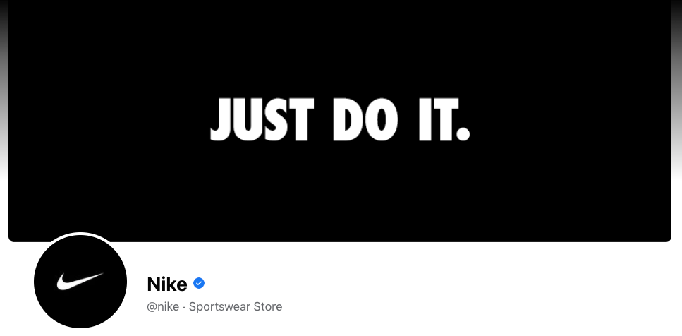
I like this example from Nike. You get their iconic slogan front and center. There’s nothing flashy, confusing, or overly promotional. It’s immediate brand recognition.
3. Keep it simple
Facebook banner images are valuable real estate, but that doesn’t mean you need to weigh them down with too much text or complicated images. You can still make good use of that space with a simple image.
Simple Facebook banners, like Nike’s reinforce the brand’s identity, while also being a clean introduction to your page.
Here’s another example from Slack:
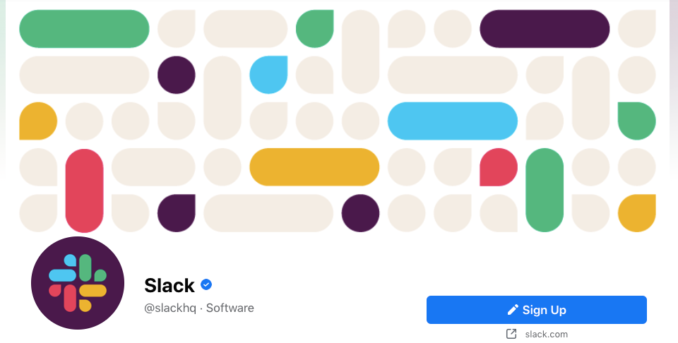
Slack users recognize the colors and the play on Slack messages, and those new to Slack see a playful but simple image. That’s a win-win.
4. Highlight news and updates
I’ve talked a lot about the value in simplicity in your Facebook banner image, but do not hesitate to use that space to show off brand highlights or news. Your page’s cover photo entices users to scroll further down your page, and some well-placed promotional content can draw them in even more.
Here’s a good example of using a Facebook banner to show business updates from Netflix:
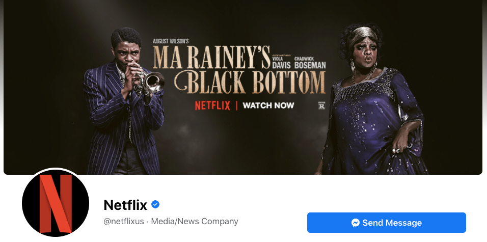
They’ve used the space to highlight a new show, and the image only shows the most important information: what, who, and that it’s now available.
5. Use a video
Yes, you can set your Facebook banner image to a video instead of a static image. The benefit is that it immediately grabs the viewer’s attention and tells your brand’s story in a matter of seconds.
Banner videos autoplay on silent, so make sure your video can get the point across without sound. You don’t want anything to be lost if they don’t turn on the sound.
The North Face uses a 21 second long video on their banner that shows how customers use their products. There’s a marathon runner, mountain climbers, skiers, and it even touches on events that have happened during 2020, like COVID-19 and protests around the world.
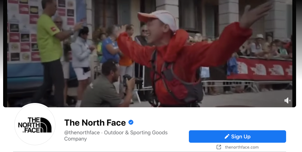
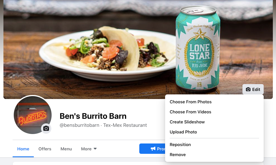
If you want to use a video as your Facebook banner image, here’s how you do it:
- Go to your page (you must be an admin)
- Click on the Edit button on the bottom corner of your cover image
- Click on Choose from Videos
The Facebook banner size for videos is a recommended 820 x 462 pixels, and videos must be between 20-90 seconds long. The minimum size for banner videos needs to be 820 x 312 pixels.
Related: 8 Facebook Advertising Tips That You Need to Try Now
The final word on Facebook banner sizes
Your Facebook banner is valuable real estate, so make use of that space with the tips you’ve just read. It needs to fit both your business’ personality and the size recommendations.
Simple mistakes like having content cut out because your image doesn’t fit can give an unprofessional impression. Don’t overlook or underestimate the value of your Facebook cover photo.

Leave a Reply