If you’re running Facebook ads for your business or someone else’s, you better follow the rules on Facebook ad size guidelines. These are handed down and ordained by Mother Facebook herself and vary depending on the type of ad you’re running.
Advertising on Facebook is really profitable for those who approach it in the right way (cough). There are hooks and buttons and copy and creative and testing and all of the things you can change from ad to ad. BUT, Facebook ad size is a technical point with strict guidelines and rules for play.
These guidelines mostly have to do with proportions based on location. Because, like everything, it’s all about location, location, location!
There’s not ONE perfect Facebook ad size because there are lots of different types of ads.
So, to help you get the most of your ad space (and make sure your ads are seen), here’s an easy guide to Facebook ad sizes and tips for doing it the right way.
First… Why does Facebook ad size matter?
Facebook will accept ads of different sizes and proportions, even if they aren’t perfect, in many cases. In addition, if your picture isn’t perfectly sized for upload and you have to pinch and prod it to make it work, even if it isn’t technically the right size, Facebook allows that too.
However…
Last year alone, advertisers spent $21 Billion on Facebook ads. It’s predicted by 2020 that Facebook ad spend will be nearly a FOURTH of all digital ad spend. This means two things:
- Oh yeah, you definitely want to get a piece of that action, get on it
- Facebook ad space is extremely competitive
Competition means that everyone is trying to beat everyone else, and ads that aren’t JUST right will not be the ads people see. So maybe your stretched-out image will appear somewhere on Facebook, but it won’t be in that gorgeous prime territory that people care about, that’s for sure.
The little things in ads are going to matter, which means that if Facebook recommends it, you should probably do it. Their playground, their rules. When you follow their rules, you spend less money (and waste less of it).
Facebook ad type and recommendations
All of this is just technical stuff, so scroll to the type of ad you are thinking about and read the specs. Keep in mind that this list is of Facebook’s recommended ad sizes. The “minimums” aren’t worth a second glance.
As you go through, you’re going to find our best tips on Facebook ad sizes, specs, and locations for each type of Facebook ads. Onward!
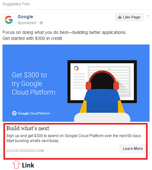
Facebook feed (images)
WITHOUT Link
- Image aspect ratio- 9:16 to 16:9
- Resolution- Highest you got
- Dimensions- 1200 x 628px
WITH Link
- Image aspect ratio- 9:16 to 16:9 but crops to 1.91:1 automatically with a link
- Resolution- 1,080 x 1,080 (more is better)
- Dimensions- 1200 x 628px

Facebook right column
Remember that these ads are only available in desktop mode. While many marketers find that they aren’t super effective, some niches – like book ads, for example – thrive in these spaces.
Here’s the recommended ad size and specs for right column ads:
- Image aspect ratio- 16:9 to 1:1
- Resolution- The highest you got
- Dimensions- 1,200 x 1,200px
Facebook Instant Articles
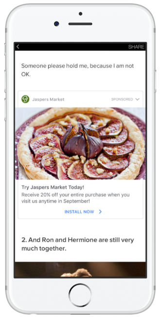
Instant Articles are a newish format that is available on both mobile and desktop. Basically, it’s an article that loads super fast and does not take the user away from Facebook. It’s placed in between breaks in the content, like before a header or after the introduction paragraph.
These are recommended specs for these ads, and an example of one below (straight from Facebook):
- Image aspect ratio- 9:16 to 16:9
- Resolution- As big as you got
- Dimensions- 1,200 x 628px

The remaining static image Facebook ad sizes
In general, ads in the marketplace, in Messenger, and in other places on and around Facebook (and Instagram) have the same expectations after the three special ones above. Those are:
- Image aspect ratio- 1.91:1 (when links are included, which they almost always are on other ads on the site)
- Resolutions- There will never be a time when we say anything other than “as big as you got.” There is no limit on the resolution when uploading, so upload whatever you have!
- Dimensions- 1,200 x 628px
But Facebook ad sizes go on and on…
There are a couple of exceptions to the image size “rules,” but they’re very niche. For your convenience, Facebook has created a handy dandy size guide, which you can access here.
While Facebook ads are effective as standalone static images, there are other offerings that might be good for specific types of businesses or ad campaigns, so let’s get into those.
About video Facebook ad sizes
You know what we’re going to say, right? Yep… videos at maximum resolution are going to be your best bet. Resolution in videos is super important says the Facebook Gods, and absolutely NO pillar boxing (which is where you put black bars around your video) to shrink it to a specific size.
Here are the recommended Facebook ads sizes for videos:
- Format- Most. Here’s a comprehensive list
- Aspect ratio- 9:16 to 16:9
- Resolution- 720p but… as big as you got
- File Size- 4 gig max
- Length- 1 second to 240 minutes (note: we do not recommend uploading a 240 minute video… like, ever. Stick to under three minutes)
- Thumbnail image- 1,200 x 675px
About carousel Facebook ad sizes
Carousel ads are for the brave, as we like to say. They can be quite beautiful and visually striking, but they are also really easy to mess up. The carousel format actually allows you to showcase up to ten images with unique links. Facebook says you can use this format to tell a story, or highlight a product or new line of products.
Unlike most of the other ads, there are not really any “recommended” stats here, but minimums and maximums, making carousel ads a bit more open-ended as far as creativity goes. However, we’ve put together a couple of recommendations based on Facebook’s rules for other ads.
- Images should be 1,080 x 1080px or larger
- High as all get-out resolution
- At least three to five images to display
- Image aspect ratio is 1:1
- Stick with PNG and JPEG
About Canvas (Instant Experience) Facebook ad sizes
To be 100% honest here: Canvas Ads are very complex and rather confusing because of the number of elements that go into them, and it is probably best to explore this option thoroughly before trying to tackle it. Canvas has very recently been rebranded to Instant Experiences, though the migration to the new name off-site has been a little slow.
These types of ads are a combination of videos, carousels, photos, products, reviews, text… all on one page, activated by a tap on a mobile device. Instant Experiences come in a few different forms including a storefront, storytelling, and lookbook.
We recommend you just read about it on Facebook because there is no one set ad size for this; you get to be creative.
Except you know what we’re going to say about resolution right?
Top 3 tips when thinking about Facebook ad sizes
Before you go off into the great big world of sizing your ads, here are a few nuggets of wisdom (in no particular order):
- Limit your text. It doesn’t matter how pretty your font is or how important the information in the text is. Limit your text. Period. Facebook has been boldly transparent about what happens when you put too much text on an ad. While sometimes ads with more than 20-30% text do clear, they almost always cost more to show to audiences. Why? Because Facebook said so, that’s why. The company likes to focus on keeping ads engaging and interesting and pretty, and that’s hard to do with clunky text on your image. There is space below and above an image and video to type what you want, so stick what you have to say there instead.
- Preview your ad placements before submitting them. Even if you followed the guidelines to a T, we still highly recommend you look at each and every placement preview before you actually launch an ad. Sometimes something just doesn’t look right and you won’t know it unless you preview it, and all of that can be done from within Business Manager. Use what ya mama Facebook gave you and ensure your ad looks freaking amazing no matter where it’s being displayed. If it doesn’t, don’t display it there. Boom.
- Keep up to date if you run a lot of ads. Facebook reserves the right to change their requirements at any time and boy howdy, they certainly take advantage of this. You’ll need to stay on top of the requirements so that if your ads start to slip, you can be SURE it isn’t because Facebook has some new guidelines about size, shape, placement, or what you can display or show. Luckily, the Facebook Ads Guide is pretty sweet. Use it, bookmark it, love it.
If you’re careful and follow the rules, you’re totally going to rock this whole Facebook ad size thing. The rest of running Facebook ads is a bit more complicated.
Need help running Facebook ads?
Whether you’re a business owner trying to do this on your own or thinking about running ads for others we can help you get started with our Facebook Side Hustle Course.
Small businesses are up against large companies who have giant marketing teams in place, and for smaller guys, it can be hard to run a good ads strategy in a way that sees real results.
Knowing that there was a market for Facebook ads managers (and knowing what a great side hustle it is), we created an affordable course that helps you start your own mini Facebook ad agency. The industry standard is to charge $1,000-$2,000/month per client, and you don’t need any marketing or website experience to get started.
In terms of time investment, after you onboard a client, create the initial ad, and do some testing (this only takes a few hours), the ads essentially run on autopilot from them on.
To learn more about the course and hear from some students, click over to the Facebook Side Hustle Course.


Leave a Reply