Facebook website conversion ads should be an important part of your ad strategy. When used the right way, these ads encourage prospects to go to your website and perform the desired action. In short, conversion ads bring people to your website and help you grow your business.
You’re bringing people off of Facebook’s platform and onto your website for specific reasons, like:
- Page visits: Your goal is to get people to explore your entire website or visit a specific page on your site.
- Take an action: Your goal is to get the audience to take a specific action, whether its visiting your site, adding things to their cart, signing up for your email list, or more.
- Sales: Your goal is to get people to make a purchase on your site.
All of these objectives are important goals for growing your business, and we’re going to give you our best tips for nailing Facebook conversion ads.
7 tips for creating Facebook website conversion ads that work
1. Your Facebook ad should match your objective
The conversion objective means you’re getting people to take an action. You want them to come to your website and do something, like make a purchase.
This objective requires bottom-of-the-funnel marketing – you’re not introducing yourself to potential customers, and you’ve already built trust. The audience is already aware of the problem you’re going to solve, and they probably already know your brand.
Facebook website conversion ads need to be designed for people who are ready to make a decision.
There are certain kinds of ads that do particularly well for this objective:
- Using success stories: If someone is still on the fence about your product or service, a compelling success story can sway them in your direction.
- Comparison table: If you want to highlight the difference between you and your competitors, you can use a comparison table to draw attention to them.
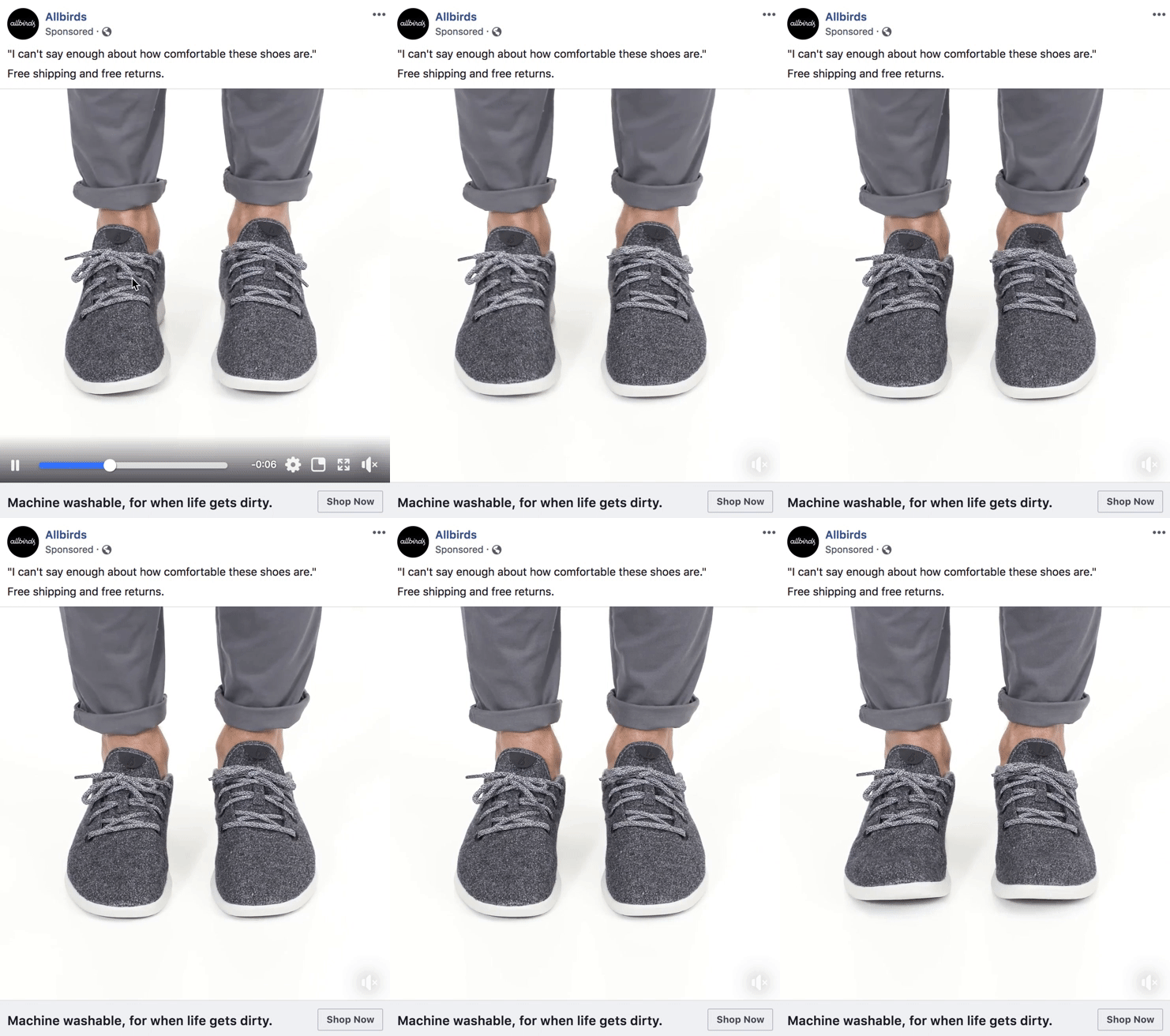
- Customer reviews and testimonials: A solid review gives prospective customers a preview of what it’s like to walk in your current customers’ shoes. Speaking of shoes, this Facebook ad from Allbirds knows how to use a customer review. And it doesn’t hurt that those shoes look ultra-comfy.

2. Make sure the Facebook Pixel is installed on your site
The Facebook pixel is a bit of code that you place on your website. The pixel collects data that you will use to optimize ads, track conversions, and create targeted audiences for future ads.
Basically, it helps you create even better Facebook ads that convert at a higher rate. It’s helping you get ads in front of the right people – the ones who are most likely to take the action you’re aiming for.
The pixel lets you collect data on over a dozen standard events (for example: purchases, leads, add to cart, add to wishlist, contact, donate, and subscribe). You can also create customized events.
Because website conversion ads are all about getting people to perform a specific action, you want the pixel to help you optimize your ads for the desired action.
Learn more about using the Facebook Pixel in our Facebook Side Hustle Course. This course is full of must-know information for Facebook ads managers, including creating custom events, troubleshooting ads, landing pages, lead forms, and much more.
You can read a review of the course at Facebook Side Hustle Course Review 2020 to learn more.
3. Define your conversion event
Because there are different kinds of website conversions, it makes sense to have different ads for each event. You need a clear goal when you start creating your ad, and realize that one ad won’t work for every kind of event.
The ad you create to get someone to subscribe to your email list should look significantly different than an ad created to make a purchase.
4. Your landing page should match the event
Your Facebook ad is one half of the conversion event. And when a user clicks on that ad and is brought to your site, they should land on a page that matches the desired action.
Say you’re running ads for an online bookstore, and you want a user to put a specific book in their shopping cart. The page they land on should bring them to the product page for that specific book so all they have to do is click “add to cart.”
If you’re running Facebook ads for a salon and want people to schedule an appointment, the landing page should be specifically for booking appointments.
You’re putting up a roadblock if you bring a prospective customer to a landing page that isn’t set up for the desired action.
One more tip for a landing page that converts: there should be continuity between the Facebook ad and the landing page. We’re talking design, language, images, etc. This tells your prospective customer that they are in the right place.
5. Use eye-catching images
Facebook has become an increasingly visual site, and for your conversion ad to stand out, you need to use on-point images. Here are a few tips for choosing eye-catching visuals for your ads:
- Use happy people: Smiling faces, people enjoying what they’re doing, this is particularly helpful for service-based businesses.
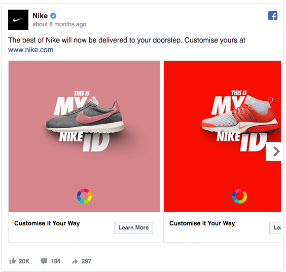
- Give a pop of color: White and a little blue are the primary colors on Facebook, so it’s pretty easy to find a color that pops on that background. Images with high-contrast colors really stand out too. Check out that contrast Nike uses in their ad.

- Use crisp and clean images: Blurry images look unprofessional, bottom line.
- People love babies and pets: This won’t work for every Facebook ad, but pets and babies are great attention grabbers. Can you get a photo of your product with a puppy? But also make sure the image matches the point of the ad.
- Use your own images: Using your own photos is a better practice than stock photos. You can show off the actual product, service, or business you’re promoting. This creates some familiarity with prospective customers.
- Not too much text: Facebook is pretty strict about the amount of text you can put on your ad image – the text cannot take up more than 20% of the photo.
- Make sure your image is the right size and shape: Facebook also has pretty strong feelings about the size and shape of images for different kinds of ads. Following Facebook’s ad size recommendations is in your best interest.
6. Write compelling copy
You’ve caught their eye with a great image, sweet! Don’t let them down with stale ad copy. Here are some copy tips for Facebook conversion ads.
Address a pain point: How will your product improve their life? Will it help them get organized, feel stronger, finally get a good night’s sleep, save them time, etc.? If you’re running a Facebook ad for a cleaning service, not having time to clean could be the pain point. Simple copy like, “Save time on cleaning” tells prospects how you can help them.
Numbers stand out: Numbers work well for a few different reasons. In headlines, numbers promise something specific. And in the copy of a Facebook ad, you can use numbers as factual evidence that your product or service works well. That could be the number of users you have worldwide, or how much money your product has saved the average user.
Avoid technical language: Your copy should be easy to understand and not bore anyone. Even if your Facebook ad is targeted to a niche audience who will understand technical jargon, you run the risk of turning people away.
“If this, then this”: This is a sentence formula to help address pain points. For example, “If you are looking for _____, then try _______.” You can replace “looking” with “need” or “want.”
Start with a question: An open-ended question that resonates with your audience is a good way to start a dialogue.
Get to the point: Think of a single sentence that tells people what you can do for them. “This espresso machine makes the best coffee.” “This training program will strengthen your core.” This is also a good reminder that short and succinct copy does better than long ad copy.
Quote a customer: It was mentioned earlier that testimonials and reviews do well, and you can pick out key quotes to encourage those conversions.
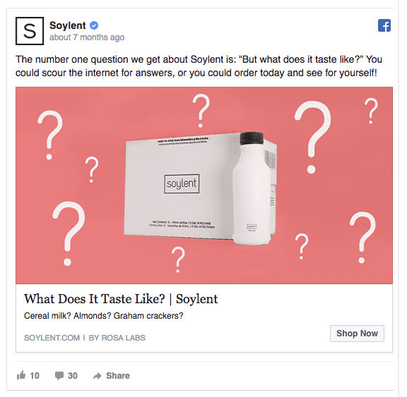
Address any doubts: Addressing concerns head-on builds trust. This ad from Soylent is a really great example of that.

See more stellar ads at 7 Example of Great Facebook Ads and Why They Work.
7. Tell the user exactly what to do
To really motivate an action – the point of a Facebook conversion ad – you need a strong call-to-action. And it should match the goal of your ad.
The CTA in the bottom right hand corner of your Facebook ad can be as simple as “Shop Now,” as long as that’s what you want prospects to do. Facebook has lots of CTA options available for all types of actions, including:
- Download
- Apply Now
- Install Now
- Subscribe
- Contact Us
- Book Now
That simple one or two-word directive can make a big difference on the number of clicks you get on your ad.
And if it’s not working… TAFO!
TAFO means “test and find out.” This is honestly one of the most important things to remember for any Facebook ad strategy.
Not all ads nail the objective on the first try, and a simple split test can help you identify why your conversion ad isn’t working.
You start by identifying one variable to change. It could be the image, copy, ad placement, delivery optimization, targeted audience, or something else. After you’ve made the change in Ads Manager, you can publish your ads.
You can run the modified ad alongside the original one and see how it does. If the ad starts converting at a higher rate, then you’ve identified the right variable. But you can keep making changes until you get the results you want.
Testing gives you some valuable insights that you can use on future ads. You can learn what kind of copy resonates with prospective customers. Does one image over another draw customers in? Or was it the ad placement?
You’ll never learn that until you… test and find out!
The final word on Facebook website conversion ads
Just going to hammer in on that last point – test and find out. Don’t get discouraged if your conversion ads aren’t working like you hoped. We’ve all been there.
Good Facebook ad managers use what didn’t work as an opportunity to create amazing ads in the future.


Leave a Reply